Product
Pricing
Learn
Sign In
Get Started
Gallery
Because the world needed more charts
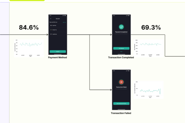
A/B Test
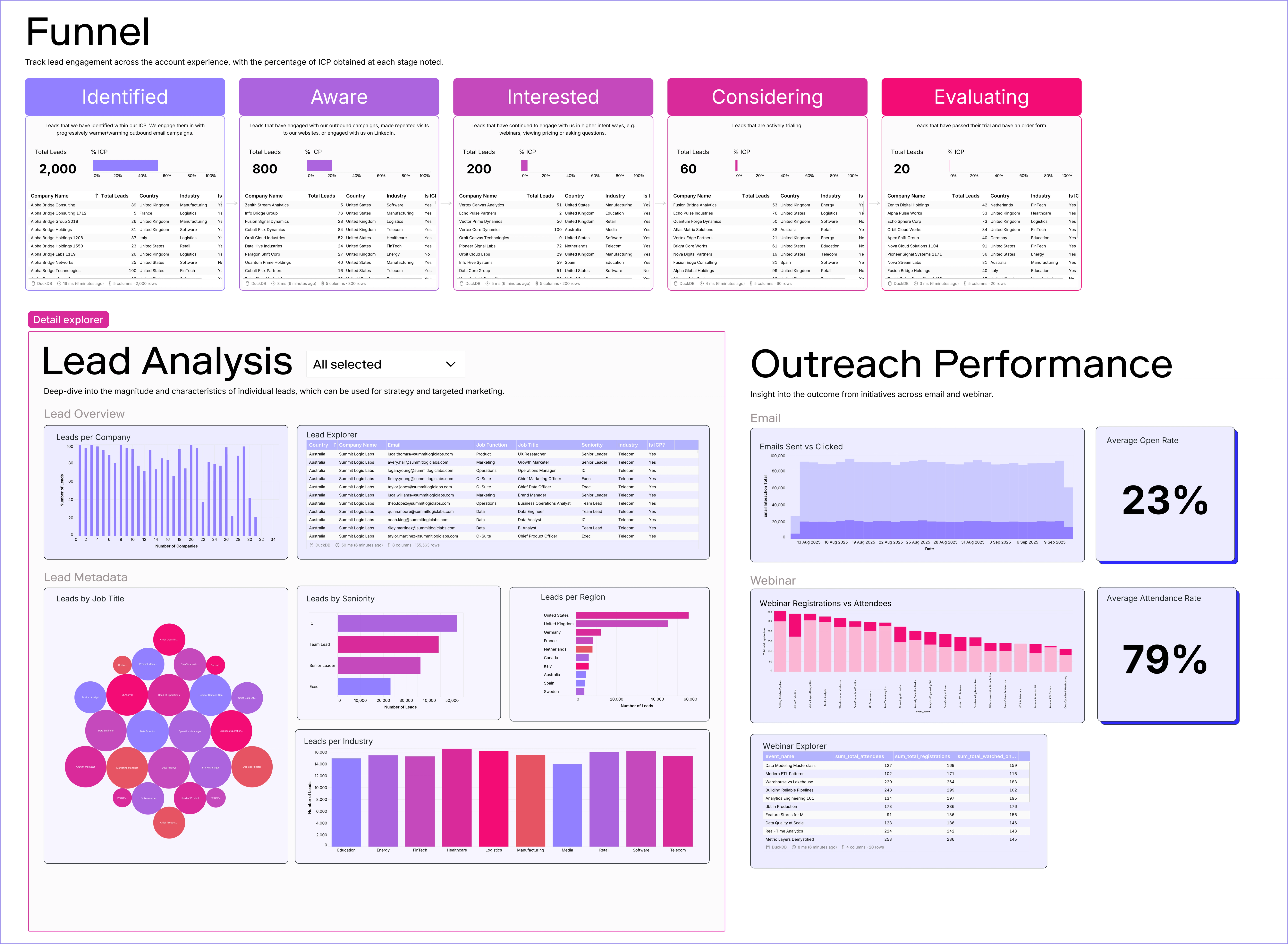
ABX Funnel
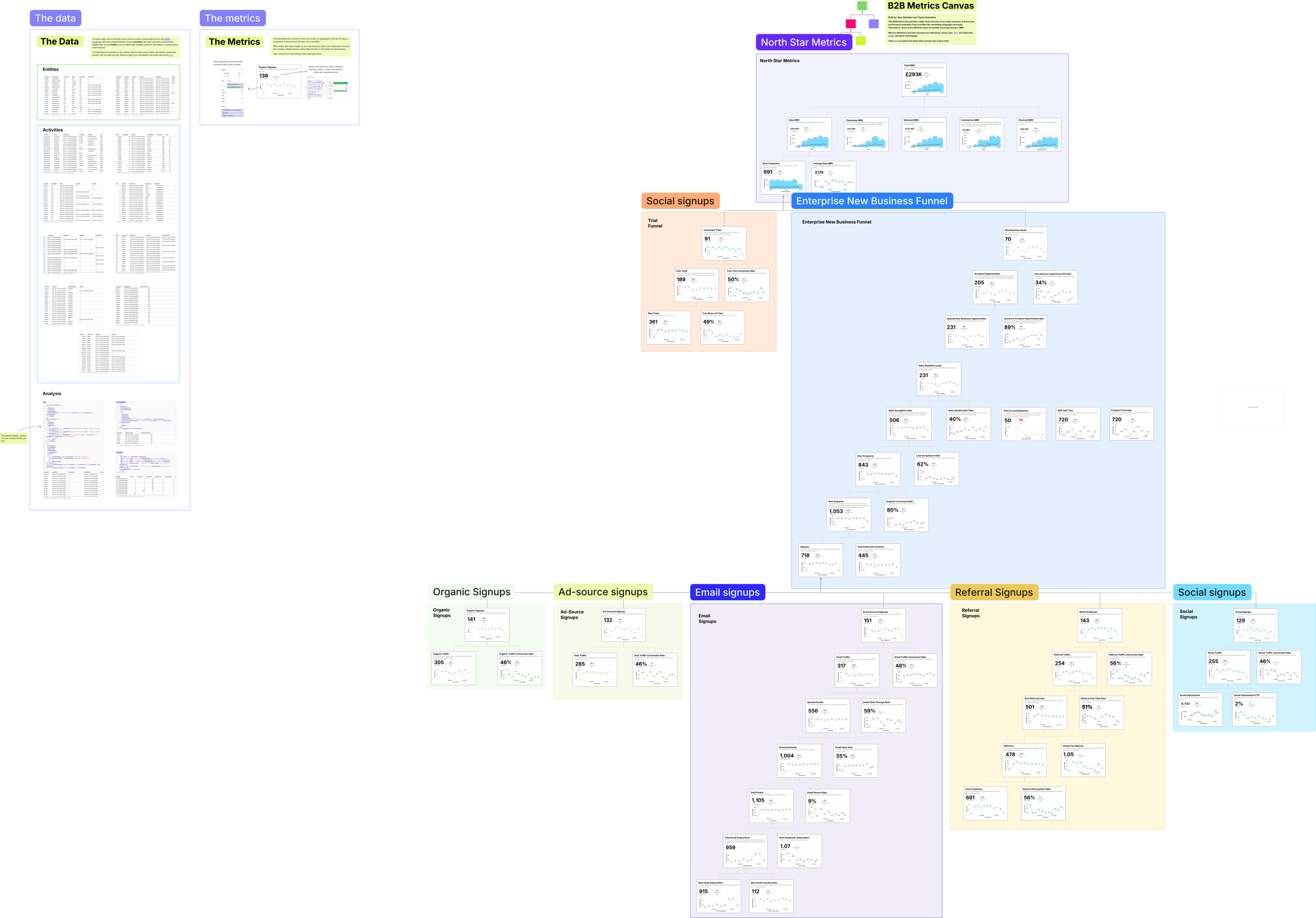
B2B SaaS Metric Tree
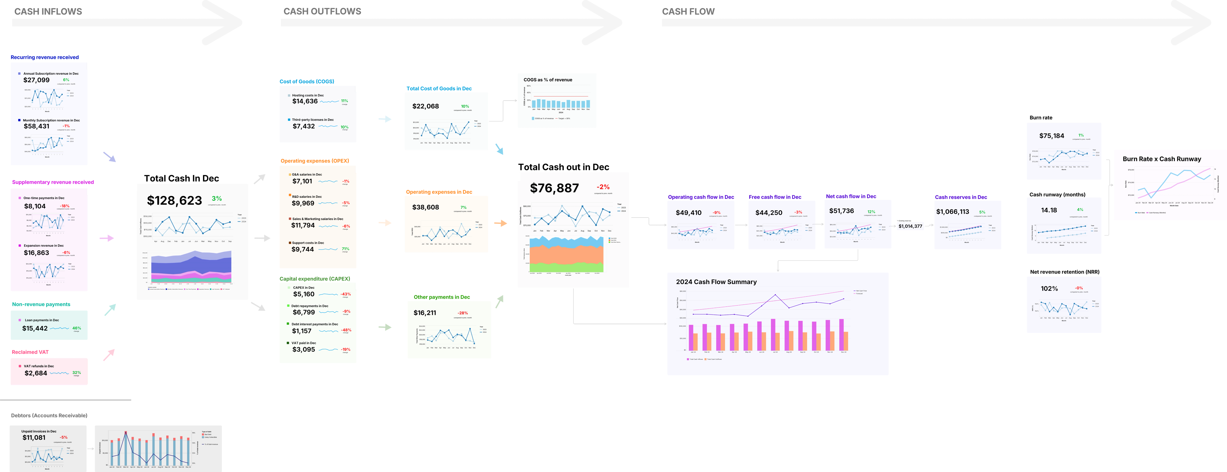
Cash Flow Map
Client Quarterly Review
Customer Journey Map
Data Exploration
Data Transformation
Duolingo's B2C Growth Model
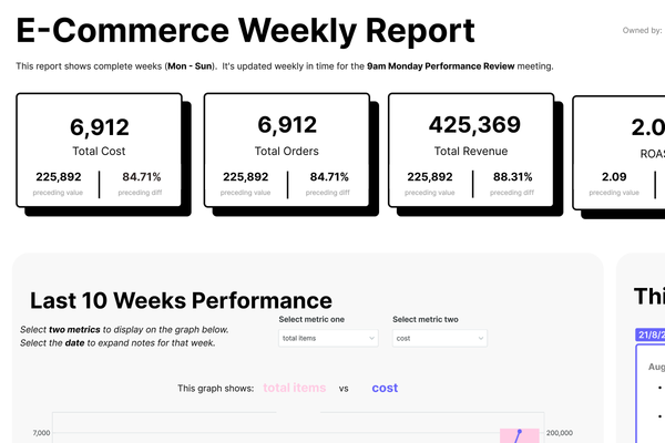
Ecommerce Overview Dashboard
Every Visual Under the Sun
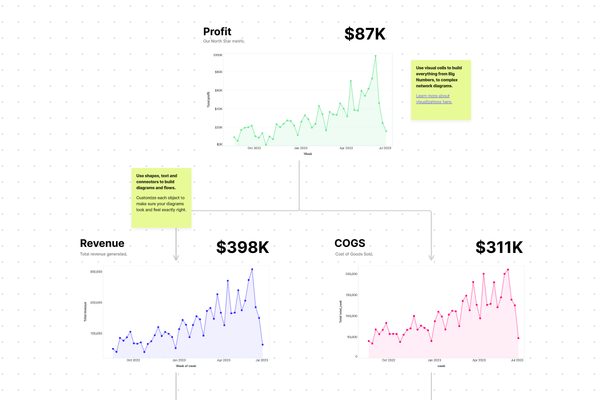
Finance Health Metric Map
GA4 Website Analytics Metric Map
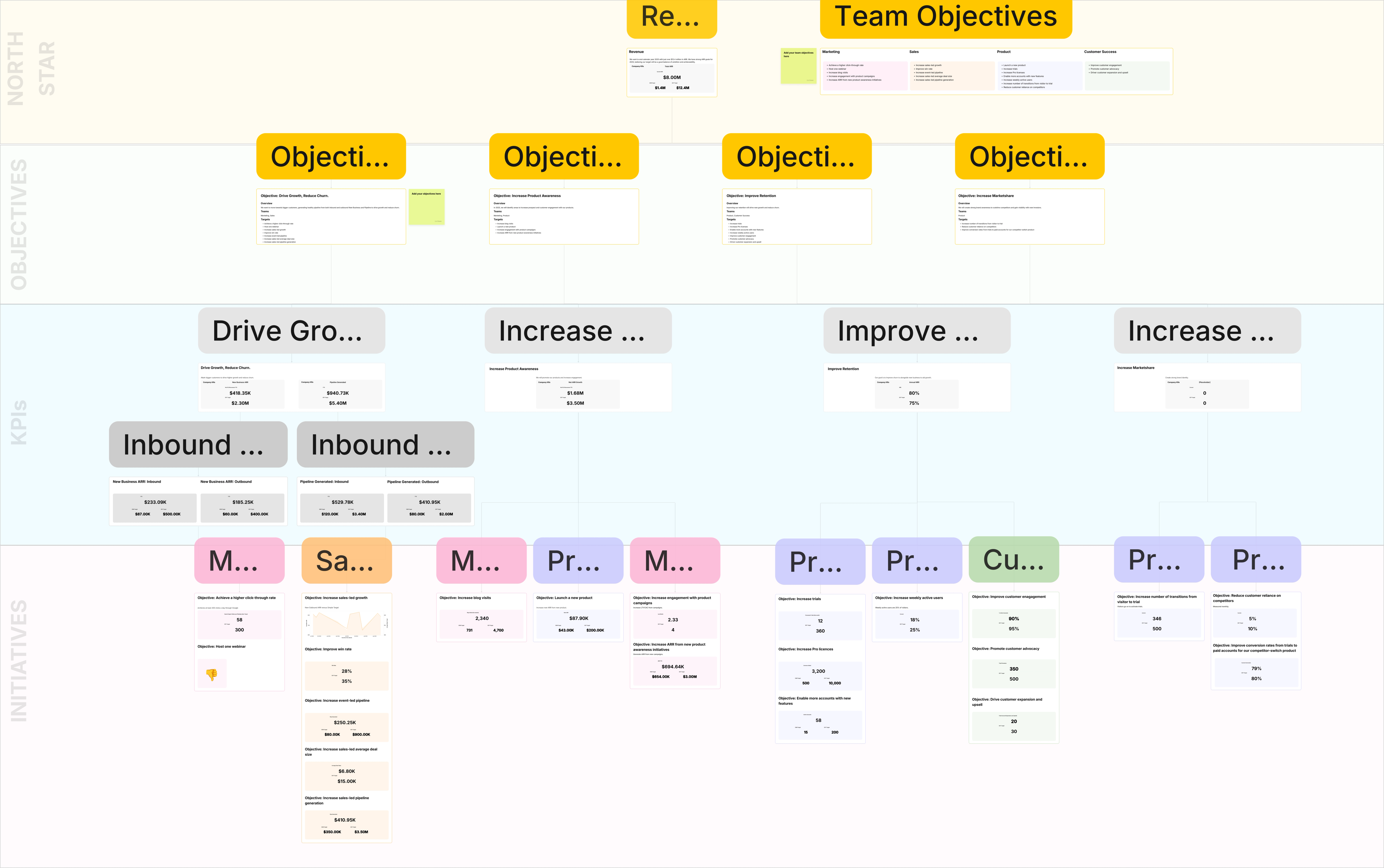
Intruder's Company OKR Canvas
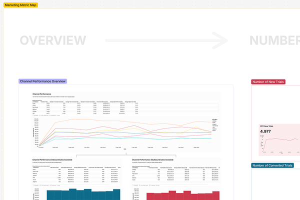
Intruder's Marketing Metrics Map
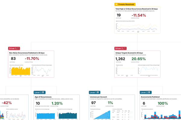
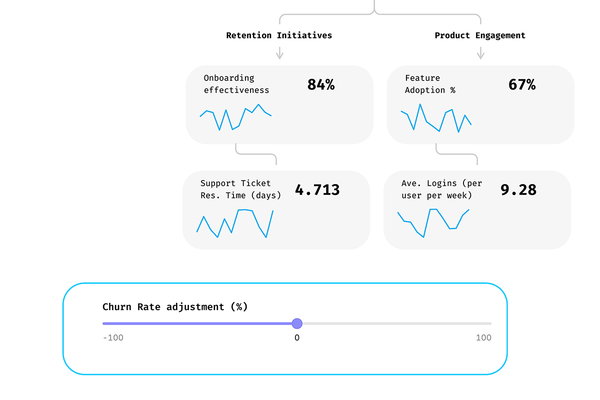
Intruder's Product Metrics Map
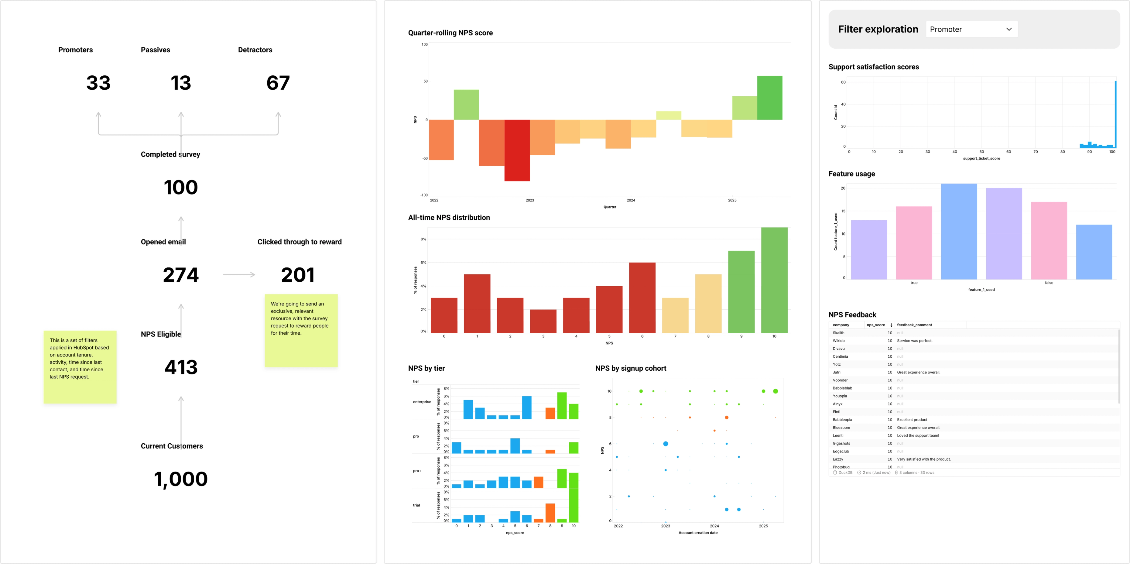
Live NPS Exploration
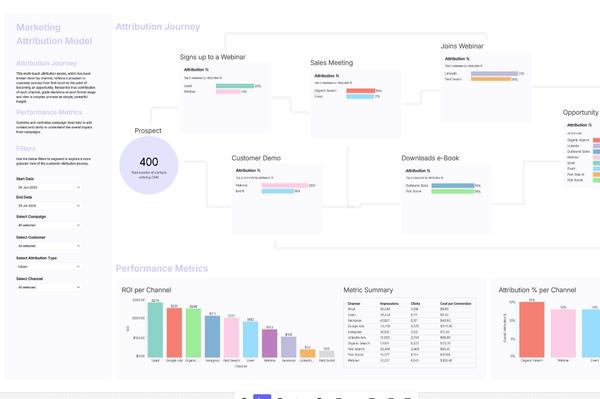
Marketing Attribution Canvas
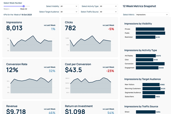
Marketing Campaign Dashboard
Metric Tree
MoonPay's B2C App Metric Tree
Onboarding Flow
Product Alignment Canvas
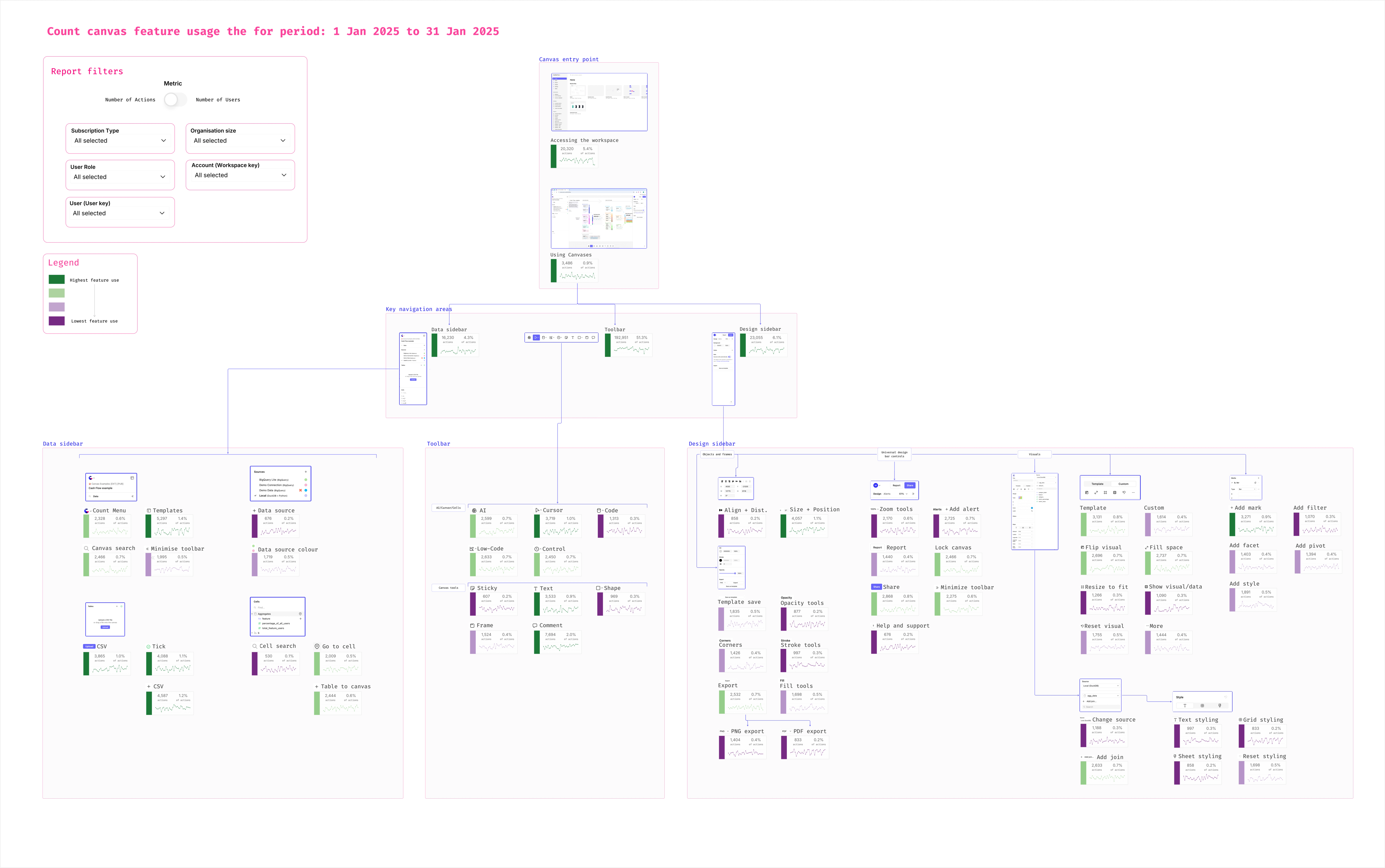
Product Feature Usage Map
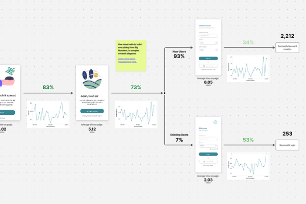
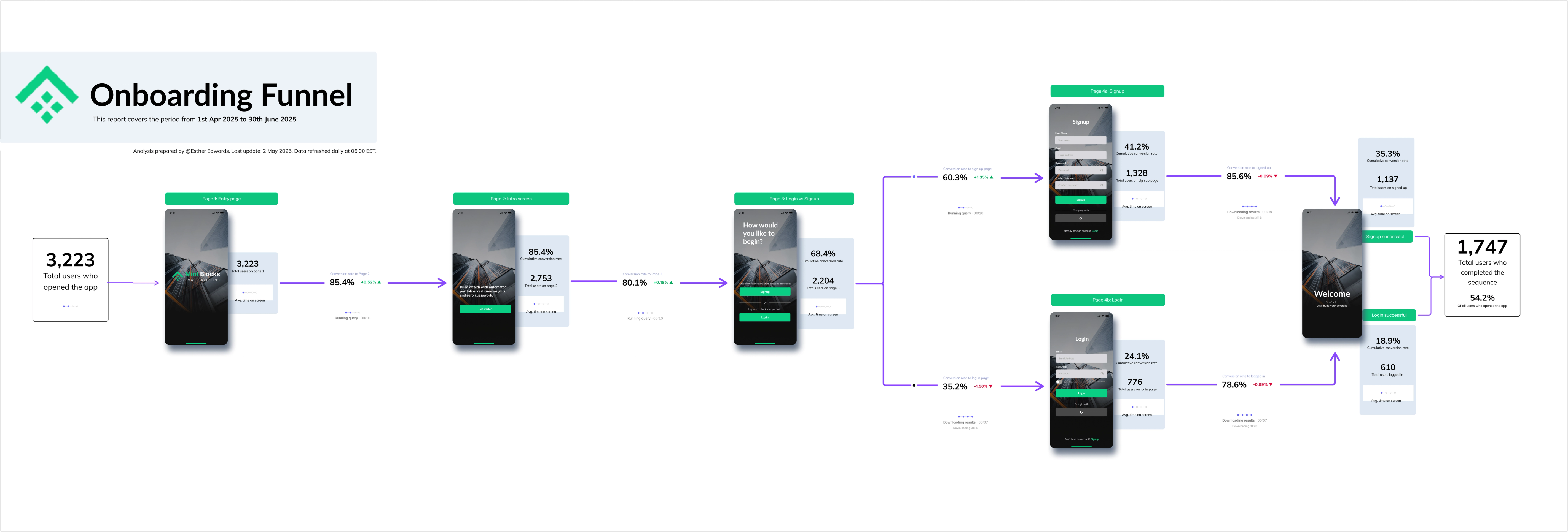
Product Onboarding Funnel
Scenario Modeling Metric Tree
Simple Onboarding Funnel
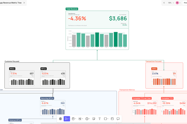
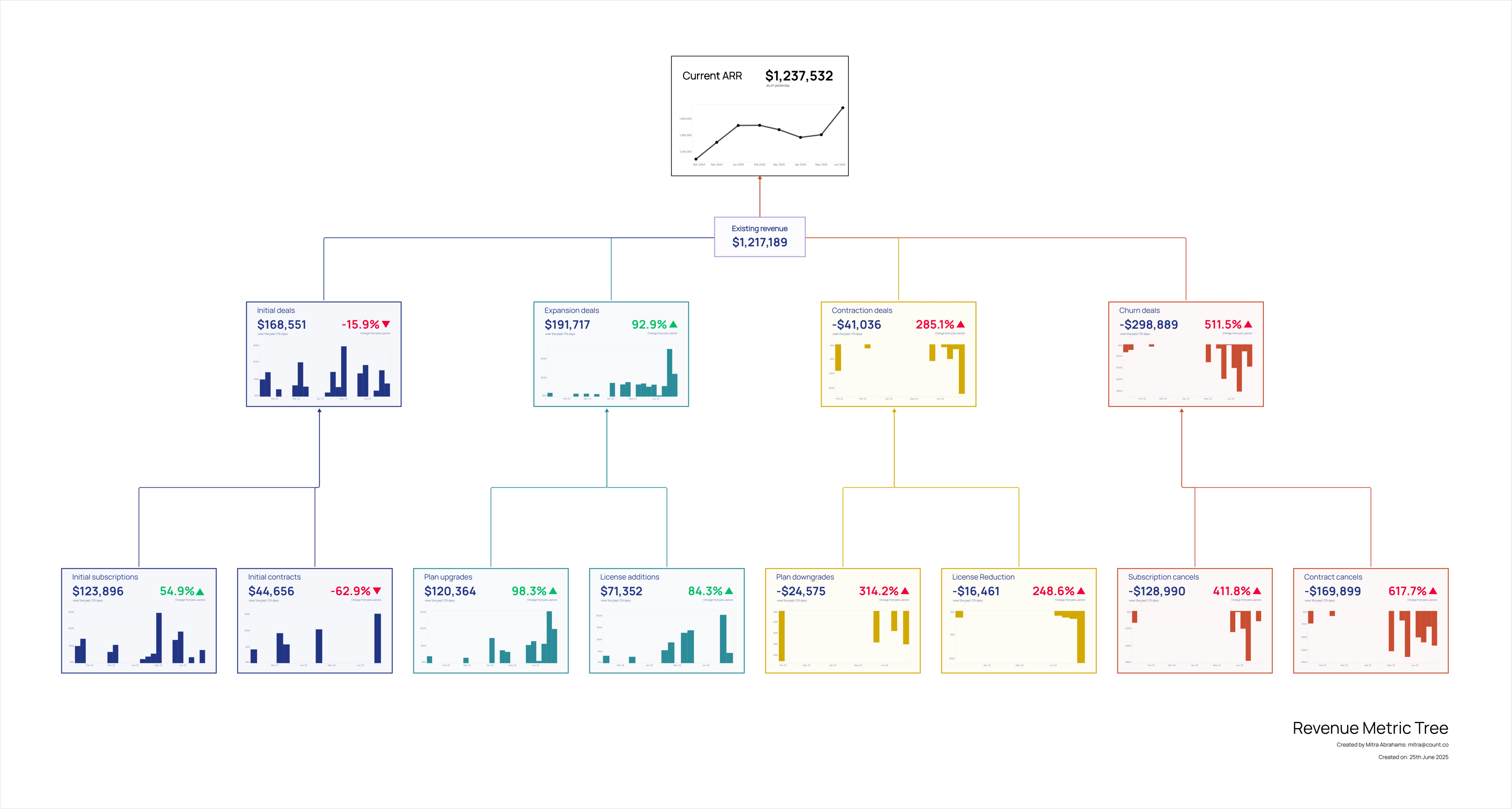
Simple Revenue Metric Tree
The Ultimate Guide to Hiring your Data Team
The Ultimate Guide to dbt
The Ultimate SQL Guide


Gallery
Because the world needed more charts