
Stop Building Product Onboarding Dashboards in the Dark
Your onboarding flow is broken. You know it. I know it. The numbers scream it every week.
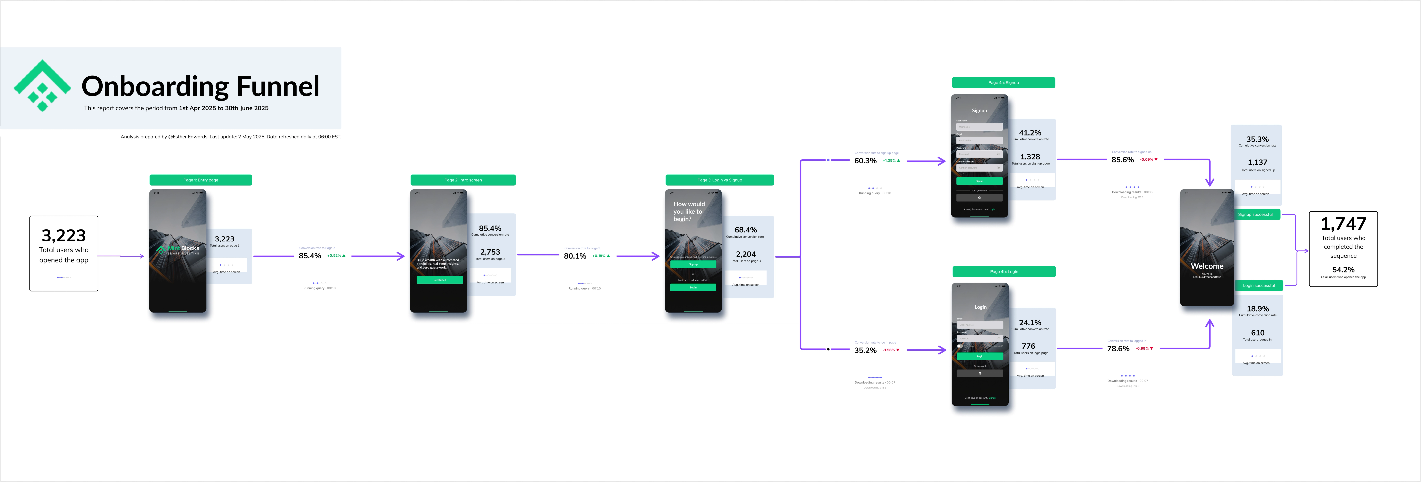
But here's the thing—most teams can't actually see where it's broken. They're squinting at context-poor dashboards that show activation rates dropping from 68% to 52% between steps… but don't show the actual product screens, the copy, the UI that's causing users to bail.
So you're debugging blind. Switching between Amplitude, screenshots in Notion, Figma mocks, a Slack thread with half-baked theories, and a Google Sheet someone made three months ago. By the time you've gathered enough context to make a decision, the data's already stale.
Yeah, that's not just you.
The Metric Tree Problem
Product onboarding is a metric tree. Users hit your activation flow, split into branches (completed profile vs. skipped), split again (invited teammates vs. solo), split again (created first project vs. bounced). Each node matters. Each drop-off point is a conversion leak costing you revenue.
But most BI tools force you to visualize this as... a table. Or a funnel chart that strips away all the context. You can see that 300 users dropped off at Step 3, but you can't see why—the actual UI, the button placement, the value prop messaging that failed.
So what do data-savvy PMs do? They recreate the entire customer journey in Miro or FigJam. They screenshot the product. They manually type in conversion rates next to each screen. They add sticky notes with hypotheses.
It looks great in the kickoff meeting.
Then the data changes. Daily. And suddenly your beautiful onboarding analysis is a static artifact gathering digital dust while the real metrics live somewhere else entirely.
You're stuck maintaining two sources of truth—the pretty collaborative board where your team does the thinking, and the dashboard where the actual data lives. Spreadsheet soup meets dashboard drama.
What If Your Metric Tree Used Real Data?
Turns out, you don't have to choose between context and accuracy.
Count's product onboarding canvas puts live data directly into your customer journey maps. Drop a screenshot of your signup screen right next to a metric card pulling real-time conversion rates from your data warehouse. Add event statistics, cohort breakdowns, time-series trends—all updating automatically as users flow through your product.
Your team can collaborate like they're in Figma. Leave stickies on drop-off points. Start threaded discussions about why mobile activation is tanking. Comment directly on the conversion rate that just dropped 15%. All in real-time, all with the actual numbers, all without rebuilding the entire analysis when your data refreshes.
It's the collaborative whiteboarding your product team loves, powered by the data infrastructure your analytics team needs. No more maintaining parallel universes of static boards and live dashboards.
The reality is this: onboarding analysis should be a living document, not a snapshot. When your activation rate changes, your team should see it immediately—in context, with the product screenshots, with the customer journey, with everyone's thoughts and hypotheses already attached.
Same canvas, same data, same conversation.
Build Once, Analyze Forever
Here's what changes when your metric trees use real data:
Sprint planning gets faster. Your PM pulls up the onboarding canvas with last week's cohort data already loaded. No data pulls, no screenshot hunts, no "wait, which version are we looking at again?"
Cross-functional alignment gets easier. Design sees the UI next to drop-off rates. Engineering sees which steps have the worst performance metrics. Customer success sees where users get confused. Everyone's literally looking at the same canvas.
Your analysis doesn't rot. That onboarding deep-dive you did in Q2? Still valuable in Q4 because the data updates automatically. Your historical thinking stays connected to current performance.
Product onboarding isn't a static flowchart problem. It's a dynamic, collaborative, data-driven problem.
Your tools should reflect that.