
Your Most-Used Feature Has 3% Adoption (You Just Don't Know It Yet)
Your engineering team just shipped a major toolbar update. Six weeks of work. New shortcuts, better UX, streamlined workflows. The team is proud.
Three months later, someone asks: "Are people actually using the new toolbar features?"
You open Amplitude. Search for the event names. Export to CSV. Count unique users. Calculate percentages. Cross-reference with total active users. Check if it's power users or everyone. Segment by account type. Try to remember what other features live in the toolbar for comparison.
Two hours later, you have an answer: 8% of users have tried the new toolbar features. Once. Most went back to the old workflow.
But here's what you still don't know: How does that compare to the rest of the toolbar? To the data sidebar? To features in the design sidebar? Is 8% good or terrible in context? Are your most-used features in completely different parts of the product? Where should you actually be investing?
Your product analytics tool tracks everything. You just can't see the whole picture.
The Feature Hierarchy Blindness Problem
Most product teams have instrumentation. Every button click, every feature interaction, every user action—it's all logged. Amplitude, Mixpanel, Heap, whatever.
But having event data isn't the same as understanding feature adoption.
Your events live in flat tables. toolbar_alignment_clicked, data_sidebar_opened, design_fill_color_changed. Thousands of events. You can query individual features. You can build funnels. You can track specific user segments.
What you can't do is see the hierarchy. You can't understand relationships. You can't spot patterns across your entire product surface area without writing custom queries for every question.
So you end up with tunnel vision:
- Your PM obsesses over one feature's adoption rate without knowing if that's high or low compared to similar features
- Your design team redesigns the toolbar without realizing most users live in the data sidebar
- Your engineering team debates sunsetting a "low usage" feature not realizing it's critical for your highest-value customers
- Your product leader asks "what are our most-used features?" and gets... a list of event names sorted by count
You're making product decisions based on incomplete context. This feature has 50K actions last month—is that good? That feature has 200 users—should we invest more or deprecate it? Nobody knows, because the numbers exist in isolation.
And here's the killer: you can't tell the difference between "high action count because everyone uses it" and "high action count because five power users click it 10,000 times." Both look the same in an event table.
What If You Could See Your Entire Product At Once?
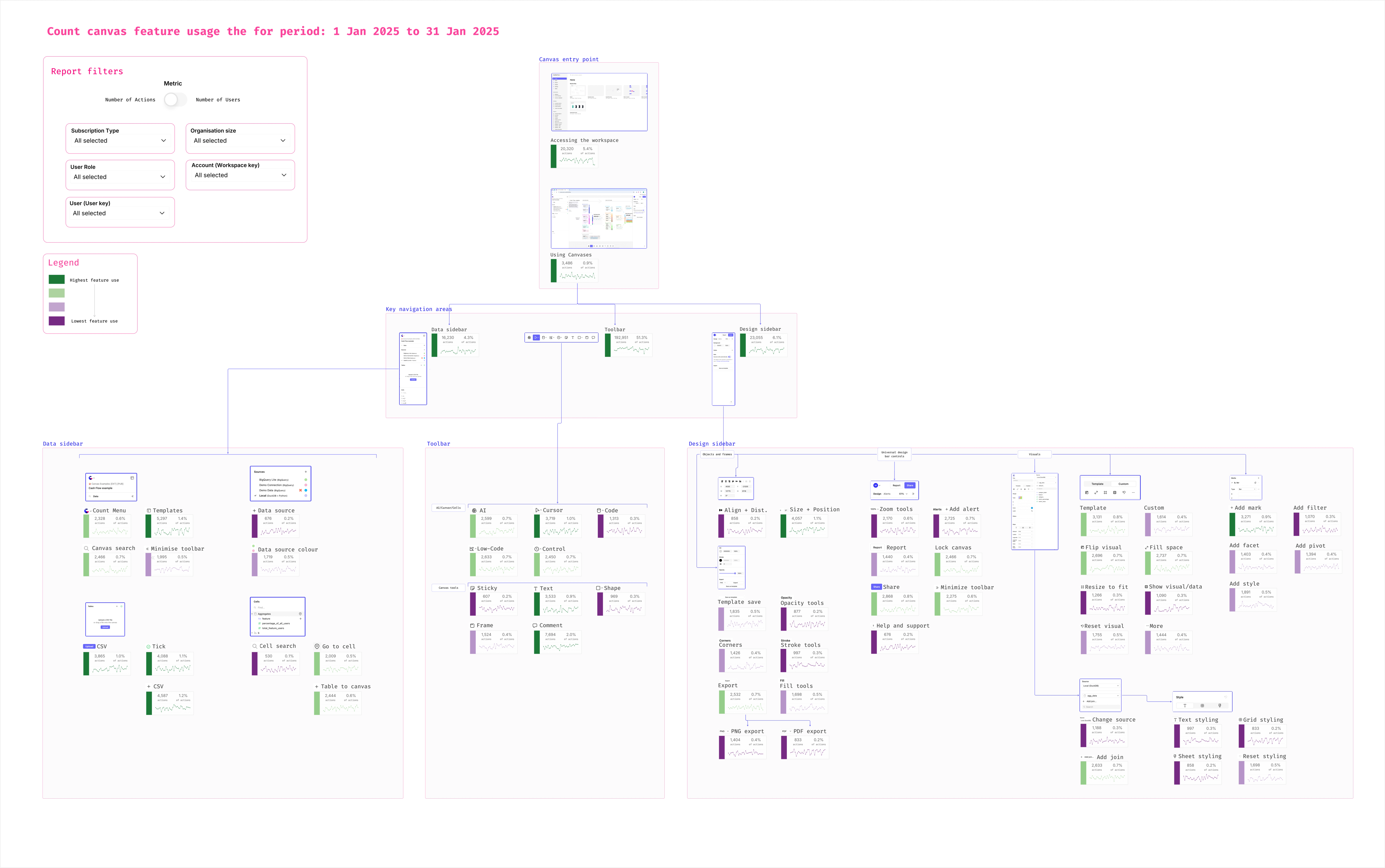
Count's product feature usage map shows your feature hierarchy—with actual usage data—in one visual canvas.
Top level: Your entry point. For Count, it's the workspace (where users see all their canvases). The gateway to everything else.
Second level: Main navigation areas. In Count's case: data sidebar, toolbar, and design sidebar—the three key interaction zones.
Third level: Individual features within each area. Every tool, every button, every capability. Each showing usage volume and percentage. Color-coded from green (highest usage) to purple (lowest).
Toggle between "number of actions" and "number of users" to see the difference between power user features and broad adoption. Filter by user type or customer workspace to zoom into specific segments or see the aggregate picture.
Which is a fancy way of saying: you can finally see which features actually matter and where your product lives.
Your PM opens the map and immediately sees: the toolbar they just redesigned? It's purple. Low usage. Meanwhile, the data sidebar—where your team spent zero time last quarter—is solid green across most features. That's where users actually work.
Your engineering team debates deprecating "Connect search" because it "only" has 1,200 actions. Then they toggle to "number of users" and realize 85% of enterprise customers use it at least weekly. Don't touch that.
Your design team thinks the alignment tools in the toolbar are critical because they see high action counts. Toggle to "number of users" and discover it's literally three power users doing 10,000 clicks. Not representative.
And because this is built on your data warehouse telemetry, it updates automatically. Last month's usage. This month's trends. Filtered to just enterprise customers. Or just power users. Or just that one customer workspace your CS team is worried about.
No more writing custom queries. No more exporting CSVs. No more making product decisions in a vacuum.
Done.
From Event Tables to Product Intelligence
Here's what changes when you can see your feature hierarchy:
Roadmap prioritization gets data-driven. Stop guessing which areas need investment. See exactly where users spend time. Build for the green zones, fix the purple ones, or accept that some features are niche and that's fine.
Deprecation decisions get context. That "low usage" feature might be business-critical for your best customers. Or it might genuinely be unused. You'll know which.
Design gets focused. Stop redesigning parts of the product nobody uses. Invest in the interaction areas that actually drive value.
The reality is: every product has a hierarchy. Entry points lead to interaction areas. Interaction areas contain features. Some features get used constantly. Others barely at all.
But most product teams only see the bottom layer—individual event counts without context. They can't see the forest for the trees.
Your telemetry captures everything. Your data warehouse stores it all. You just need to visualize it hierarchically—workspace to navigation areas to individual features—with usage data that shows both action volume and user adoption.
Build your feature usage map once. Connect it to your product analytics events. Filter by the segments that matter. And finally answer "where do our users actually spend their time?" with a visual instead of a spreadsheet.