
Your NPS Score Is Lying to You (Because You're Missing Half the Story)
Your Q3 NPS report just landed. 47. Down three points from last quarter.
Someone schedules a meeting. You spend an hour dissecting the number. "We need to improve customer satisfaction." Everyone nods. The meeting ends.
Nothing changes.
Here's why: that 47 doesn't tell you who is unhappy, why they're unhappy, or what you should actually do about it. It's just a number in a quarterly deck, disconnected from the customer data that would make it actionable.
Your detractors aren't a monolith. Some are early-stage customers still figuring out your product. Some are enterprise accounts with unresolved support tickets. Some are power users frustrated by a missing feature. But your NPS tool doesn't know any of that—it just knows they circled a 4.
So your CS team keeps doing generic outreach. Your product team keeps guessing at priorities. And your NPS score keeps drifting because you're treating symptoms without diagnosing the actual problem.
Turns out, NPS isn't useless. It's just incomplete.
The Context Gap
Most companies treat NPS like a report card. Send the survey. Collect the scores. Calculate the average. Present it to leadership. File it away.
But the survey tool where your NPS lives doesn't know that your biggest detractor is also your highest ARR account three months from renewal. It doesn't know that all your promoters are on the Pro tier with 10x feature adoption. It doesn't know that customers who submitted support tickets in the last 30 days are scoring 25 points lower than everyone else.
That context lives in your CRM. Your product analytics. Your support system. Your data warehouse.
The NPS score lives... somewhere else entirely.
So you're stuck with correlation questions you can't answer: Do customers who use Feature X score higher? Are specific cohorts churning quietly? Which customer segments should we actually prioritize for improvement?
Your CS team wants to do proactive outreach to at-risk accounts, but they're working off a spreadsheet someone exported last week. Your product team wants to prioritize based on user feedback, but they're reading verbatim comments without any customer context. Your executives want to understand the trend, but all they see is a line going down.
Same NPS data, completely different blind spots.
What If Your NPS Canvas Knew Who Was Scoring What?
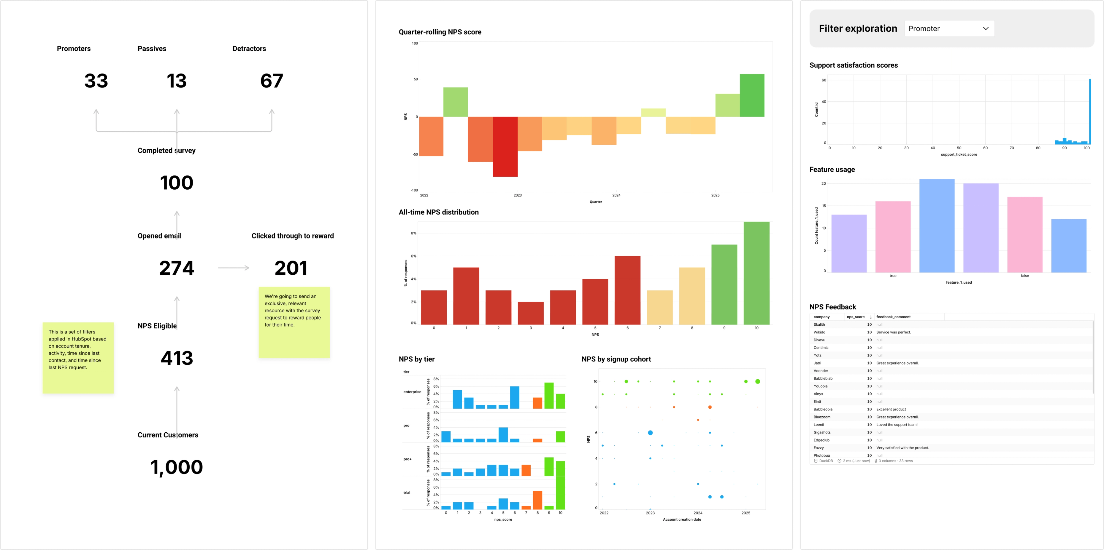
Count's NPS exploration canvas connects survey responses directly to your customer data in real time.
Drop your NPS scores—promoters, passives, detractors—right next to signup cohort breakdowns, customer tier segments, feature usage patterns, and support ticket resolution satisfaction. All pulling from your data warehouse where your survey tool (Survicate, Delighted, whatever exports to BigQuery) dumps responses automatically.
Which is a fancy way of saying: you can finally see who gave you that score and why it matters.
Spot the pattern immediately: your detractors are concentrated in Q1 signups who never completed onboarding. Your promoters are enterprise customers with dedicated CSMs and high feature adoption. That passives-to-detractors slide last month? All customers who had support tickets resolved as "Won't Fix."
And because it's a canvas, your team can actually do something with this. Your CS lead drops a sticky on the detractor segment with high ARR: "Priority outreach list—renewal risk." Your product manager comments on the feature usage correlation: "Promoters use Reports 3x more—should we surface this earlier in onboarding?" Your support team sees the ticket satisfaction impact and starts a threaded discussion about SLA changes.
This isn't a quarterly report. It's a living exploration of customer sentiment connected to the context that makes it actionable.
From Vanity Metric to Action Plan
Here's what changes when your NPS has context:
CS gets predictive. See detractor scores spike in a specific customer tier? Proactive outreach before they churn, not reactive damage control after they've left.
Product gets signal. Connect feature usage to satisfaction scores. Suddenly you're not guessing what to build—you're seeing what makes customers happy.
Leadership gets clarity. That three-point NPS drop isn't mysterious anymore. It's tied to a support backlog, a pricing tier issue, or an onboarding gap. Actual diagnosis, actual solution.
The reality is: NPS measures something real. Customer sentiment matters. But a score without context is just corporate theater.
Build your NPS canvas once. Connect it to your customer data. Let your survey tool feed it automatically through BigQuery. And finally turn that quarterly number into daily customer intelligence that actually drives improvement.
Your customers are telling you what's wrong.
You just need to connect their score to their story.